
Should the color of the wallboard be lighter or darker than the wall? —— Comprehensive analysis of how to choose wallpanel color
In interior decoration, the color of the wallboard is not only part of the decoration, but also directly affects the visual effect and atmosphere of the overall space. Especially when choosing the color of the wallboard, we often face a question: should the color of the wallboard be lighter or darker than the wall? This article will analyze in detail from multiple angles such as different scenes, visual effects and practical applications to provide you with professional advice.
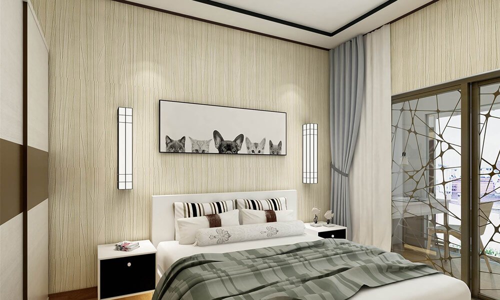
1. The wallboard is lighter than the wall: enhance the brightness of the space
Applicable scenarios
- Rooms with small space or poor lighting, such as apartment living rooms and small bedrooms.
- Hope to create a bright and open visual effect.
Visual effect
Light-colored wallboards such as white, light gray or beige can reflect more light, making the space appear more spacious and transparent. Especially in rooms with low ceiling heights, light-colored wallboards can weaken the sense of oppression and create a comfortable living environment.
Recommended color matching
- White wallboards with gray walls: create a modern and simple style, suitable for urban apartments.
- Light beige wallboards with dark brown walls: increase warmth, suitable for family living rooms or bedrooms
- Light green wall panels and dark blue walls: Create a fresh and natural atmosphere, suitable for children’s rooms or pastoral style spaces.
Notes
Although light-colored wall panels can make the space brighter, they may appear monotonous if the contrast with the wall color is too strong. Therefore, you can add decorative paintings or border lines appropriately to increase the sense of design.

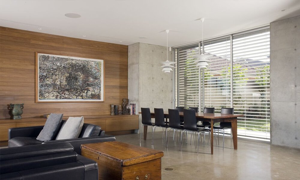
2. Wall panels are darker than walls: enhance the sense of hierarchy and stability
Applicable scenarios
- Large spaces or rooms with ample lighting, such as villa living rooms and office meeting rooms.
- Hope to create a warm and stable indoor atmosphere.
Visual effects
Dark wall panels, such as dark brown, dark blue or dark green, have a more prominent texture, giving people a sense of luxury and heaviness. Especially in spacious spaces, dark wall panels can enhance the overall style and become a visual focus.
Recommended color matching
- Dark brown wall panels with light gray walls: suitable for retro or industrial style decoration.
- Dark blue wall panels with off-white walls: show noble and elegant temperament, suitable for modern style home study rooms.
- Black wall panels with light yellow walls: strong contrast, suitable for avant-garde fashion design.
Notes
Dark wall panels easily absorb light, so they may appear depressing in rooms with insufficient lighting. This problem can be improved by increasing the brightness of the lights or choosing glossy materials.

3. The wall panels and walls are similar in color: a soft and harmonious space atmosphere
Applicable scenarios
- The overall style is low-key and unified, suitable for minimalist spaces.
- The space function is mainly quiet and comfortable, such as bedrooms or reading rooms.
Visual effect
When the wall panels and walls are similar in color, such as light gray with medium gray, the color contrast can be weakened to create a warm and soft indoor environment. This combination is particularly suitable for minimalist decoration styles, which makes people feel calm and relaxed.
Recommended color matching
- Light gray wall panels and medium gray walls: low-key and high-end, suitable for bedrooms or modern style spaces.
- Light beige wall panels with off-white walls: warm and natural, suitable for family living rooms or dining rooms.
Precautions
This combination needs to be embellished with soft furnishings such as furniture, carpets, curtains, etc., otherwise it may appear bland and boring.
4. How to choose the right wall panel color?
Choose according to the function of the space
- Public areas: such as living rooms or meeting rooms, it is recommended to use a strong contrasting color combination to make the space more layered.
- Private space: such as bedroom or study, you can choose similar color or light color wall panels to create a warm and peaceful atmosphere.
Choose according to lighting conditions
- Dark wall panels are suitable for spaces with sufficient light.
- Light-colored wall panels are suitable for spaces with insufficient light.
Matching overall style
- Modern minimalist style: light-colored wall panels or gray wall panels are preferred.
- Vintage style: dark brown, dark green and other dark wall panels can better highlight the texture.
- Natural pastoral style: light green and light wood color wall panels are preferred.
5. Recommendations for purchasing wall panel colors
1. Sample test: When purchasing wall panels, it is recommended to ask for samples first, place them in the room for a day, and feel the effects under different light.
2. Coordinate with furniture: The color of the wall panels should be coordinated with furniture, floors, curtains, etc. to avoid color conflicts.
3. Consider psychological effects: dark wall panels are suitable for calm and serious scenes, and light wall panels are more relaxing.
Conclusion
There is no absolute right or wrong in choosing the color of the wall panel. The key lies in the fit with the overall space and decoration requirements. By reasonably matching the color of the wall panel and the wall, you can not only improve the beauty of the space, but also enhance the comfort of living. I hope that the analysis of this article can provide valuable reference for your decoration decision and make your space shine with unique charm!